Mastering Photography

Throwback to one of my favourite group shoots

This is a throwback to an old shoot . This was an absolutely fabulous shoot for so many different reasons. 

One photographer had access to this wonderful location and suggested as a possible place to shoot. Another photographer arranged for drinks, another brought their flash softbox as of course I arranged for my flash equipment, tripods etc and of course wonderful Emily to join us. The outcome: everyone working together to help capture some timeless and incredible images. 

There were so many different options available, shooting in the floral garden area with the backdrop of St Pauls in the background. On the other side, a view of the Shard and below you could see the trains running by. Choosing to shoot in the evening helped further, even though we had some overcast weather, the sun did strike through on occasion to create some gorgeous back lighting creating even more ethereal looking portraits with the plants in the foreground. 

Evening ended with some lovely City of London landscape views so I took the opportunity to take out my 24mm prime lens and took a few quick snaps before the garden closed up. 

You can learn more about my wider photographic work by subscribing to my YouTube Channel. See you there!

Every Street Fashion Shoot I Am Improving With My Rangefinder

After a first set of good results with my Fuji GSWiii, from the shoot with Anna, I organised a group shoot with Luise back in Central London.

I hadn’t seen these togs for quite some time so it was a great opportunity to catch up and enjoy some photography together.

I chose to shoot some Ektachrome and Kodak Gold in today's outing and we started off outside Bank.

When I turned up, I found a commercial shoot going on which looked pretty intense and another tog with her makeup artist taking shots on the steps.

Luckily the commercial group were wrapping up and they were on their way out. Perfect time for us to swoop in and start taking shots!

With only 8 frames to each roll of film, the 6 by 9 film size is incredible to view, especially on colour positive film.

I was confident that Ektachrome would perform well today given the lighting conditions. There would not be a need for off camera flash today.

How to Shoot with Rangefinders in Bright Sunny Conditions

First shot, super overexposed, unfortunately something to carefully consider for next time. In the broad strong sunlight perhaps underexposing by a stop or two may help to resolve this issue.

The second shot performed better although there appears to be a blue tinny cast to the image. I’m not exactly sure why this is. If you know or have a hypothesis I would love to hear it in the comments below.

The sunlight was exceptionally strong today and at times difficult to keep your eyes open without some sunnies on.

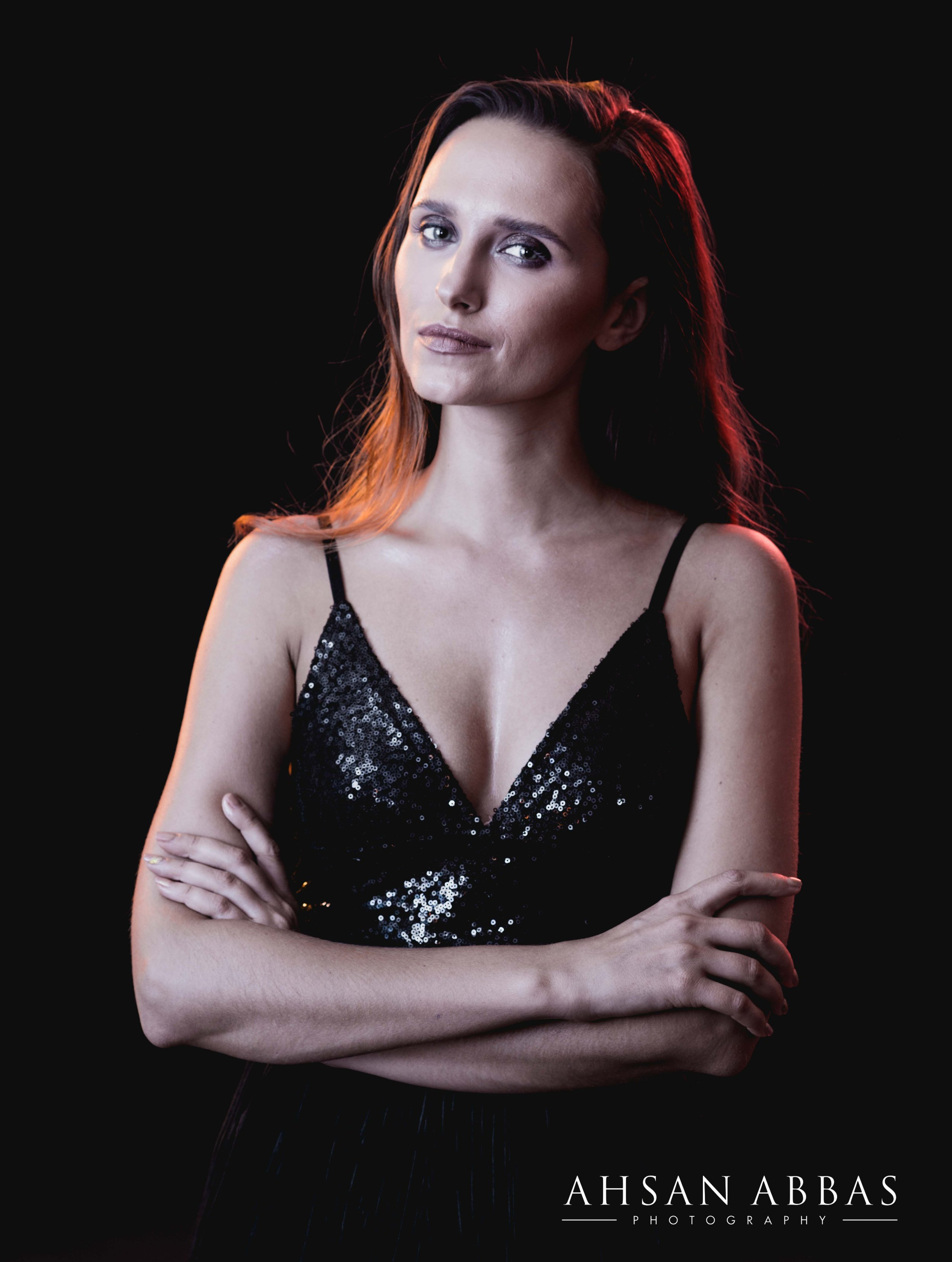
In this shot, I asked Luise to close her eyes and imagine something longingly while resting on the stairs.

The whites have come out brilliantly white and probably has been compounded by the whitish reflection off the stairs too.

Key takeaway here is to avoid bright white clothing in bright sunny daylight conditions!

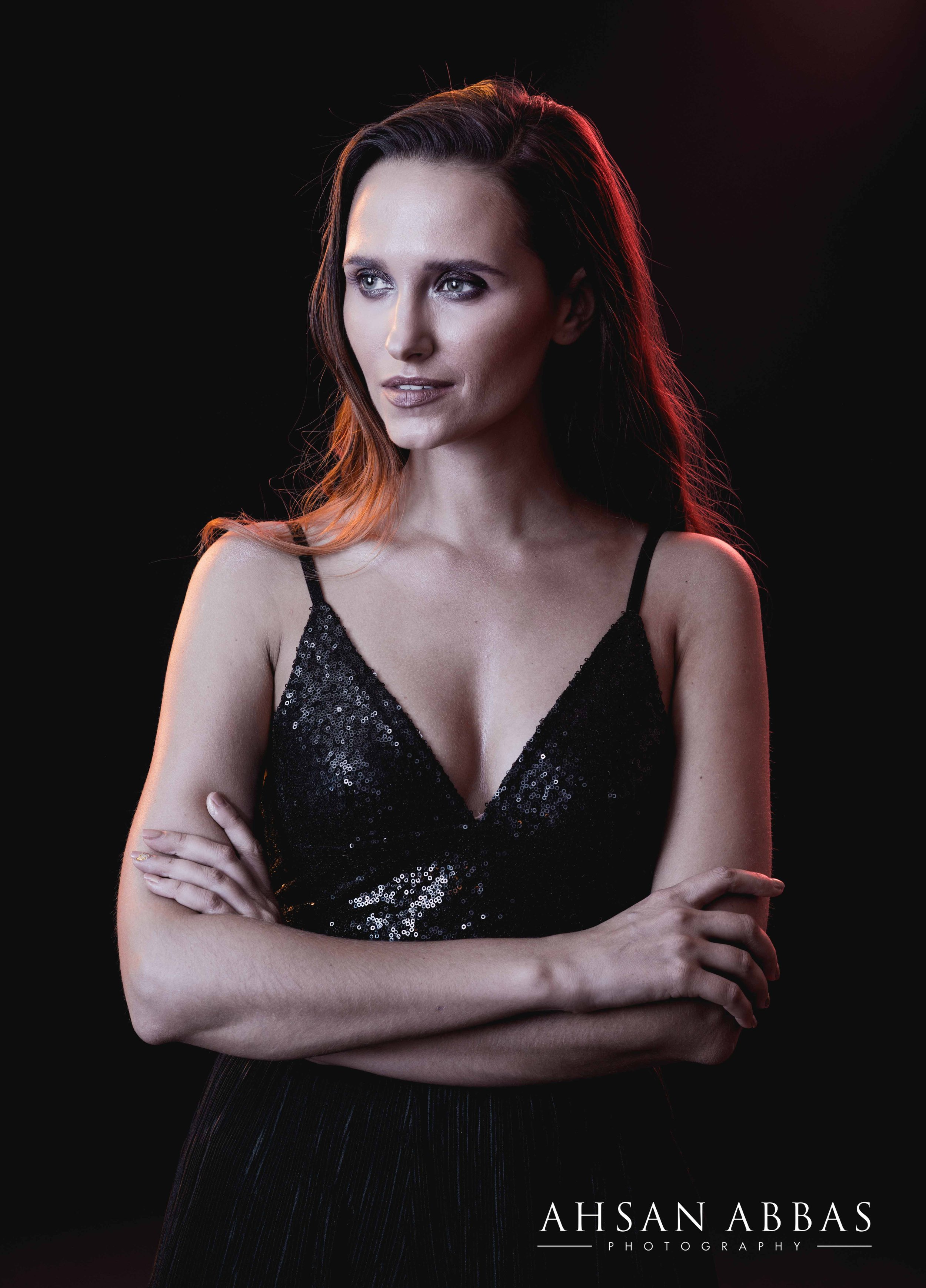
A momentary shade and this image was captured spot on. I like the way Luise is looking down the barrel of the camera but also how arms and legs are creating triangular shapes which adds to the compositional balance of this image!

It’s also good to see the highlights not being blown out and the colours in this frame have come out remarkably accurately!

How to Posing Tall Subjects and why your positioning and lens choice matters

A quick side note here, be careful when posing tall subjects. Shooting from a low angle will accentuate the profile of your subject whereas shooting from a higher angle will exaggerate the torso and shorten the legs.

If your focus is on the head and chest of the subject then shooting from above would be recommended but for full length shots this should be avoided. This is mainly because your shot will compress the subject’s profile creating unflattering results.

To get the best results, use an appropriate lens which flatters the subject. In my case, I was working with a fixed 65mm lens, which is equivalent to a 28mm lens on a 35mm camera.

That is a relatively wide angle lens. Perfect for street photography but one to carefully use if shooting portraits.

Ultimately, a great pose is captured in camera with the combination of the right camera angle, body position, and focal length!

Got Luise to lay back for the next shot and you can see immediately the sun was back out in full force. Slide film scanning is proving to be quite a challenge, but with practice this will improve further.

We finished off at the steps with this shot. A reflector or an translucent umbrella would have helped reduce the amount of light falling on Luise but I like the pose again as is, the use of triangles but also the columns in the background accentuating the height or sense of scale in the image.

We decided to move away from the stairs and took some on this bench. This image has come out almost tack sharp and the image looks fantastic on this slide.

Working with large rangefinders can be tricky, however, you may have noticed the image has been a bit cropped off at the bottom.

To avoid such errors with these cameras give yourself a little bit more space within the frame in your visor. The more you shoot with this camera or similar ones, the more skilled you will become. It’s all about continually mastering your craft!

A follow up shot with Luise sat down looking into the distance. Again the colour reproduction here is absolutely spot on with the general tones of the outfit and setting creating a fitting vibe.

We changed it up a little again trying to get some more shade going down into the underground however, it was a little tricky here and whilst the colour reproduction was good I was working on f5.6 with shutter speed of 1/30sec which has added a little motion blur to the image.

The final shot was taken with Luise resting her arm on the railing, a slight miscalculation of the distance has given this image a bit of a defocused look.

I found Kodak Gold 120 to be very reliable

I switched up to shoot some Kodak Gold, colour negative film, which tends to be a little more forgiving. Be sure to check out my previous videos on Kodak Gold.

I have found it to be very reliable and brought some along as a substitute just in case I had completely blown the first set on Ektachrome

Luise was a superstar and switched up her outfits in no time. We got to shoot with her in this bold yellow outfit which was spot on!

I really like this image of Luise standing in the middle of the road. Don’t be deceived by the white lines, that is the bike lane in this extremely narrow road.

It was a case of darting in and out to shoot here but we got the shot! Don’t do this unless you have someone watching your back! Thank you Marcus!

Next time, I would move in much closer because the focus of the image is Luise and not the surroundings.

Moved back to the tiny sidewalk and took this full body portrait. Kodak Gold does have a tendency to leave this warmer tone, which in this case added to a late afternoon feel.

With time pressing, I took these two quick shots again focusing on full body composition and then moving in for a closer shot before finishing off with a relaxed pose on the wall.

How to setup your rangefinder to get the best images every time

Overall, this was the second time out shooting fashion with my Fuji GSWiii. Biggest learning from this shoot was that I needed to carefully consider the settings in strong sunlight.

Even with light metering you will need to carefully consider the type of film you are shooting with. Moving into a little more shaded location would perhaps have resulted in more reliable outcomes on this slide film.

I am sure you have lots of your own photos, how often do you spend reviewing them? You have seen that I make lots of mistakes too but the key here is to go back and reflect on your work.

By doing this, you will be able to make those incremental improvements.

With time, your images will become even better, so when you come back to look at your first photographic work, you’ll look back to see how far you have come!

If you are new to shooting with the Fuji GSWiii or similar cameras then it takes some practice to get your distances spot on too. It can be a little tricky using the rangefinder to focus accurately.

Try not to put too much pressure on yourself with time limitations. This is so you can be more considerate with your actual distances between you and your subject. Therefore making sure you get the sharpest image possible every time.

This particular Fuji comes with a fixed 65mm lens and if you enjoy shooting street photography it could be a fun companion with its 28mm, 35mm camera equivalent lens. I’m curious how an actual Leica would feel like shooting with, perhaps one day!

Although primarily known for landscape photography, the Fuji GSWiii has the potential to give photographers new creative opportunities in portrait photography.

I think in future shoots I’m going to try and get in more closer shots to see how the image reproduces.

Overall, once again I feel the closer I was shooting to Luise, the richer the details in each of the frames. Next time, avoid bare sunlight too!

With more shoots I will slowly find my preference, Let’s see where this takes me next!

Want to stay in the loop with what I am up to and my work? Keep coming back to ahsanabbas.com/journal

For more videos subscribe and turn on the notifications for your weekly video drop!

Use Props to Create Incredible Photographs

In the previous blog post I discussed the importance of communication with your model so you can capture the best images possible for your portfolio. 

Planning in advance is important from your position to. Knowing what the model will be wearing from top to bottom will give you the opportunity to create in advance. Take for example this picture. Emma is holding this Eastern Umbrella which I found in a market. Knowing she was jumping in this striped outfit I noticed the similarities in colour and put the two together. 

I like these sets of images because there's a blend of so many different cultures and environments. A mixture of the brutalist architecture of the Barbican Estate combined with Eastern elegance through a western dance movement and outfit. 

Photography is a joyful activity and as such should be treated in a complimentary way. Have a look around at home what little props you might be able to add to your shoot. It doesn’t need to be big, something small and light to carry will come in handy diversifying the images you take. Have a scrummage around, see what you find and get shooting! 

You can learn more about my wider photographic work by subscribing to my YouTube Channel. See you there!

Velvia 50 on Nikon FA

Velvia 50 on Nikon FA

A review of Fuji Velvia 50 35mm Film. In this video I will explain its key features of this film and it's film speed. I will go through what formats the film is currently available in and which are being discontinued by 2023. Through the images you will see how the film performs in bright sunny conditions and I will explain how you can get the best results in different conditions. I will go through the right filters to use to get the perfectly balanced image every time from bright daylight to twilight portrait conditions. Finally, I will go through how to process, scan and make your prints.

Read More

What is important in Headshot Photography?

I have gone through several iterations of this image. The question in the back of my mind is, what is the purpose of this image, who is this for, who is viewing it, what impression does it strike. 

In the first edit, I like the slight blue/black tinge to the background and the warm textured face. There is a healthy glow and it communicates comfort and vitality. 

The second edit is a more real life representation of the textures and tones. The hair and skin tones in particular, the light falling further off from the back of the head. The image communicates a sense of confidence and assuredness. In contrast to the first image, which is a bit more moodier and a little more mysterious. 

The black and white iteration is one that works very well. The clarity of the image, soft textures and tones on a hard black background communicate and a soft yet authentic authority. 

Taking headshots is in itself artwork. You have to be very cognizant of clients background, the purpose of the shoot and how potential viewers will perceive them A photographers job is getting to know them as quickly and as rapidly as possible. An image that truly reflects the needs of the client is often set by the tone and communication between his or her photographer. 

All these images were shot on a Nikon D800, 85mm f/1.4 lens. The ISO was set to 200, aperture to f/8.0 and shutter speed 1/100sec.  All edits were completed in Adobe Lightroom 2022. 

You can learn more about my wider photographic work by subscribing to my YouTube Channel. See you on there!

Street Fashion Shoot With My Fuji GSWiii

I have just had my Fuji GSWiii sit at home waiting for that perfect chance to shoot some landscape images on film. Knowing myself, I figured I would have to create an opportunity! 

With only 8 frames to each roll of film, the 6 by 9 film size is incredible to view, especially on colour positive film.  I parked my trusted Bronica Zenza ETRS and decided to get out and use this camera more this summer. 

This particular GSWiii comes with a 65mm lens which I believe is equivalent to a 28mm lens on a 35mm camera. 

First shoot opportunity came from a shoot setup with Anna. She was in the country and we set up a shoot in Central London late one afternoon. 

I threw in a whole bunch of medium format rolls into my bag and over the next few hours we shot natural light as well as with my wonderful profoto umbrella and profoto A1. 

Shooting Fuji Provia 100F in Natural Light

We started off by shooting on the colour positive film Provia 100F. It was a late afternoon shoot, hence why I brought along my off camera flash. These images were all taken using natural light. 

I really like this image of Anna in her chequered jacket and blue jeans looking over in the distance. 

The colours came out natural to the eye which I was really surprised to see considering the relatively low level light available at the time. 

The details are captured in this frame with Anna resting one leg down while resting her head gently against her left hand. 

The details in the jeans combined with the reds and yellows in the fore and background add more energy to the image. 

The highlights are perhaps a little overexposed but something that can be managed in a future shoot in camera or in post production! 

Going in a bit closer, once again the colour and detail of the 6 by 9 negative has really come out super well. 

This image of her holding the rose, combined with the red seat and red lipstick draw in the line of sight making it a compositionally attractive image to view. 

This combined with how her arms make an almost symmetrical look on either side in reflection to the legs.

I took another image of her standing up with the rose and framed this one up. I think these more close up portrait shots could be the way to go! 

Ending this set I took this shot which is a little out of focus but I really like the effect and emotion coming through the image and this is definitely one of my favourite shots from the Provia batch! 

Kodak Ektachrome in Natural Light

Well, If I was going to shoot some Provia, I was going to have to shoot some Ektachrome to see the differences in colour. 

Unlike the Bronica unfortunately you don't have the luxury of swapping film backs to capture identical images but I tried my best to keep the frames similar in nature throughout. 

Starting off with this shot, the colours are a bit more subdued but nevertheless deliver outstanding colour rendition. 

Part of the ability to shoot well with subjects comes down to how well you both come prepared to shoot. Certainly Anna, turned up with the perfect outfits for a befitting urban location shoot.

As before I took a combination of closer shots combined with wider shots to see the differences between the images. The consistent theme throughout is the more subdued colour rendition. 

I think, in part, maybe there were clouds passing through in comparison to the stronger light experienced when shooting the Provia roll. 

Nevertheless, you can see the film doesn’t perform as strongly in the shadows. Overall, pleased with this batch of images and my personal favourite was this shot of Anna with her arms crossed holding her jacket. 

Shooting Kodak Gold 200

Kodak Gold has made a comeback to medium format and it has been great to see so many photographers getting out and shooting this film. 

Carrying on with the same outfit and vibe, I decided to shoot some in a different location to catch a bit more of the afternoon sunset. 

This time a combination of natural light which has come out with much warmer tones and then brought in the umbrella and profoto to capture these shots with a little bit more controlled light. 

The colour is better balanced particularly with the wonderful warm sunset light radiating off the back of the Victorian buildings. Bit of a New York vibe, no?

Shooting Kodak Portra 800 with Flash

It was twilight and having these tall buildings surrounding us didnt help too much with the light either. It is somewhat fitting that for a camera that I have not shot much with I was reminded to take out some of that Portra 800 that had been knocking about in my film stash from quite a way back. 

I wasn’t going to waste this roll on the hope the images would come out by shooting this pushed 1 stop, let alone 3 stops. All these images were taken having metered using my Sekonic L-308X with the umbrella and profoto a1. 

Shot with this brick backdrop first, trying to capture some variation in styles from Anna. I like the one with Anna sat on the curb out of this mini set. We moved on to take a few with this black backdrop which I think has colourwise come out much stronger. 

When I first saw this on the film strip it looked as if the image had been taken with a greenscreen backdrop applied. 

In hindsight, I was beginning to think how different these images would look had they been shot on Portra 160 or Portra 400. Personally, I don't think it would be very different. What do you think? 

Important Considerations Shooting with Fuji GSWiii

If you are looking to shoot with this wonderful rangefinder camera here are my thoughts on some things you should consider before shooting away. 

First, if you are shooting portraits you have got to make sure you measure the distances between yourself and the subject accurately. 

If you have wonderful 20:20 vision then you might be thinking, wait why can't you just use the rangefinder optics? 

This can be a bit tricky for me and I suspect probably for many others that may have particular eye conditions. 

Easiest way to get around this is to measure the distances. Honestly this will save you a lot of lost frames. 

This particular Fuji comes with a fixed 65mm and if you enjoy shooting street photography could be a fun companion with its 28mm 35mm camera equivalent lens. 

Although primarily known for landscape photography, the  Fuji GSWiii has the potential to give photographers new creative opportunities in portrait photography.  

It got me thinking, are modern digital cameras up to the level of old school medium format cameras? 

I’m not sure, but it could be a fun experiment! Do you have experience with this? Let me know in the comments below. 

Overall, I feel the closer I was shooting to Anna, the richer the details in each of the frames. Images with natural light use of off camera flash came out super well. 

With more shoots I will slowly find my preference, Let’s see where this takes me next! 

Want to stay in the loop with what I am up to and my work? Then keep checking up on my journal here so you’ll never miss a moment!

I got inspiration from Dorothea Lange to create these images

I remember taking this picture to test out how the dark blue gel would look on camera. 

More recently when I came back to review this from a fresh perspective, it reminded me of Dorothea Lange's iconic shot of the migrant woman with her child. 

I cropped up the image and started having a play. At first I was thinking, why not take some inspiration from Andy Worhol and play around with pop  colours. Here are some outcomes from some playful edits in Adobe Lightroom. 

Mona Lisa, that image popped into my head, Elina’s expression is almost a replica. Only if she had been turned a little more to her right and her hand gently resting over her other. However, as a viewer you could be standing at different angles and perceive her to be looking at you!

Unfortunately, I was not going to get much natural colour out of this image to attempt to replicate the famous painting so back to Dorothea Lange’s portrait. 

Original Image using Blue Gel and Nikon D800

‘Pop Look’

Lange’s original image was black and white, so naturally I decided to start playing around with different black and white filters on Adobe Lightroom. Here are the results from that test. With the blue filter in place the image was much brighter but far too contrasty in comparison to Lange’s work. 

After a slight exposure adjustment and dehazing of the image I came to this outcome. I like the sharp contrasting metallic look and feel of the image. I didn’t do any retouching of the image keeping in mind Lange’s iconic authentic capture. 

After benching the image for a while, I came to look at it from a fresh perspective. Looking back at early 18th century cyanotypes, I wondered if I could recreate the same look with this image due to the strong overcast of blue from the gel. 

‘Cyanotype Look’

‘Wet Plate Collodion Look’

To get this cyanotype lookalike I increased the exposure, shadows while reducing the highlights and whites from the image. A little bit of dehazing and some reduction in saturation led to this outcome which was quite pleasing. 

Wet plate collodion photography is fascinating to watch being done right in front of you. Thanks to the digital era one doesn’t need to spend too much time getting all the materials required to recreate an attempted look in Lightroom.

Final Image edited in Adobe Lightroom 2022

To create this image I flipped the image in to black and white and for good measure added in some fine grain. 

All these images were shot on a Nikon D800, 85mm f/1.4 lens. The ISO was set to 100, aperture to f/4.0 and shutter speed 1/100sec.  

You can learn more about my wider photographic work by subscribing to my YouTube Channel. See you on there!


Quickly Remove Stray Hair In Photoshop 2022

Lots of stray hair in your portraits? Tired of taking it out bit by bit and then get put off and dont return back to your work? In this blog post I will show you how you can quickly edit you portraits. 

I am using Photoshop 2022 for this edit, however, it doesn’t matter which edition you are using because these tools haven’t changed much over the years. 

Finished Edit in Photoshop 2022

  1. Open your image in Photoshop, right click in Lightroom 

  2. In Photoshop create a ‘Background Copy’ of the image

  3. Select the Quick Mask Tool

  4. Flip to Black over White

  5. Select the ‘Paint Brush’ tool. Make sure the Soft Brush tool is selected

  6. Make the ‘Brush’ size as large as needed to cover the subject

  7. Turn the ‘Hardness’ of the Paint Brush to 85%

  8. Mask the desired area - it should colour pinkish red 

  9. When chosen area has been masked move on to next step

  10. Select the ‘Clone Stamp’ tool 

  11. Change the ‘Size’ to 300px and the ‘Hardness’ to 0. 

  12. Flip From White to Black

  13. Choose an area for cloning by holding down CMD or CTRL and then click on the desired area

  14. Now using the ‘Clone Stamp’ tool gently paint over the areas outside the dotted lines

  15. Keep adjusting the area being cloned closer to where the area is being painted over. This stops random cloning that disfigures your image!

  16. When finished, go to ‘Select’ and click ‘Deselect’ 

  17. Save your image! 

Well done, the whole process should take less than 4 minutes and with time your speed and efficiency will improve to reduce this time further. 

Here are some before and after shots. 

Before the edit, in Lightroom

After Editing in Photoshop 2022

I love how these images came out from the moment I saw them on the back of my camera. Take the time to keep reviewing and tinkering with different poses and looks. 

All these images were shot on a Nikon D800, 85mm f/1.4 lens. A blue gel was using from the left hand side of Elina. A red gel was using from the right! 

You can learn more about shooting fashion and portraits on my YouTube Channel. See you on there!


6 Top Tips on Shooting Bold Portraits with Gels

Shot on Nikon D800, ISO 100, f5.6, 1/100sec

Working with Gels can be a little overwhelming when starting at first. 

Such is the process that everyone goes through regardless of what task or assignment they are working on. 

The setup for this gel shoot was a simple three light setup. The coloured gels were red on the left of Elina and orange on the right of her shoulder. 

A beauty dish was angled slightly to the right to create a perfect triangle on her left cheek with the shadow dropping off. 

With such dramatic portraits, there are plenty of things to keep in mind before you start shooting. 


6 Top Tips on Shooting Bold Portraits with Gels

Shot on Nikon D800, ISO 100, f5.6, 1/100sec

  1. Communicate with your subject - getting to know them in advance can create a more chilled atmosphere and thus more authentic portraits

  2. With your theme in mind have a selection of matching outfits ready 

  3. Carrying on from point 2 - have a colour scheme in mind as this will help you style as well as communicate what you want from your make up artist (MUA)

  4. Have an MUA on hand to make sure that the images you capture a picture perfect in camera, saving considerable time in post

  5. Setup your lights in advance, have a play with them before you start shooting

  6. Master photographers always use a dedicated light meter - so use one! While most digital camera have excellent light meters on board. A dedicated one will help you meter for the exact highlights and shadows that you want in your image. A Sekonic L-308X is a good starting point. 

Shot on Nikon D800, ISO 100, f5.6, 1/100sec

I love how these images came out from the moment I saw them on the back of my camera. Take the time to keep reviewing and tinkering with different poses and looks. 

All these images were shot on a Nikon D800, 85mm f/1.4 lens.

Sometimes you may get ‘the shot’ right away, sometimes it takes a few adjustments. Be patient, communicate with your subject continuously and enjoy the process!

You can learn more about shooting fashion and portraits on my YouTube Channel. See you on there!

What happens if you shoot an 18 year old Kodak Portra 400 BW stored in a loft?

20 year old Kodak Portra Black and White film - what could go wrong?

This roll had been kept in the loft for over 20 years and honestly with all that I have read about expired rolls and my brief experience with Velvia 50 I was not expecting anything to turn out! This particular roll expired in October 2004 packed up and left in the dense heat of a loft. As you will see from the images to come that to my complete surprise it has done quite well.

This roll was pushed 1.5 stops in development which probably aided the image rendition. Portra 400BW was the successor to the BW400CN.  This newer generation of film tabular grain emulsions (or more commonly known as T-grain) was a chromogenic black and white negative. It’s advantage was that it could be easily processed  in C-41 chemistry! Another comparative advantage was this film could be shot from as low as 50 ISO and pushed up to 1600 ISO. 

This wider latitude would increase its versatility allowing photographers to be able to use this in a wide range of varied light conditions. As with other faster film stocks such as Kodak TMax or Tri-X I was expecting to see slightly less or smoother grain being a portrait B&W film stock. What are your thoughts on this? I loaded it on to the little brick Canon QL17 and shot away with it wherever and whenever I got an opportunity to do so. The film was shot over a short period of time at different locations! 

It was a bright sunny day with a few clouds when I took this picture of the countryside. The film has rendered well, although the clouds look a bit washed out they are just about visible.It needs to be taken in to account that the Canon’s old and heavily used lens probably had a significant part to play in the image capture. With bright white surfaces it also performed relatively well, yes those are penguins in frame. Native English ones. With more textures in frame the film performed at its best outside. Here are some native English pink flamingos. 

Every shot I adjusted the aperture and shutter speeds to give the film the best chance to perform indoors as well as outdoors. Unsurprisingly indoors with very little light it struggled although somehow managed to give a haze of an image. You can see from the shot that it performed better with light and my favorite is the shot of this very dramatic looking corridor. 

You might be thinking, dude, this is Portra film stock so where are the portraits! Fear not! In all honesty I really had extremely low expectations of anything turning up on this film so consequently I did get nonchalant with it. Anyway here are some shots I took with Fadhillah, you can check out the full shoot in my previous drops with Kodak Gold, Ektachrome and Provia 100F. 

One of the advantages of the Canon is that you can really get close to your subject so this came in handy to see the comparisons with narrow and wide shots on this film stock. With these shots there were some very tall trees surrounding us with direct sunlight intermittently falling through. You can see in this case the film has rendered well although the shadows are little bit on the darker end. In comparison to these shots where there was less vegetation restricting the direct sunlight there images have been slightly more overexposed. Now this could also be down to the Canon lens which is susceptible to perform less well in brightly lit conditions! This image came out super! This area was far more covered so the light was heavily restricted, the composition and look here is on point! 

This image of Evie was taken with a modelling lamp on which has clearly helped but still the film struggled with the conditions. The one in the corridor with natural light falling through the window fared slightly better on the white dress but struggled with the shadows. This shot of Evie in bright afternoon light fared the best with the contrasts in the light and shadows. She is well lit and with her shadow as well as the window panes adds detail and depth to this image. Outside the film also performed well in lower light afternoon conditions and images came out well exposed albeit the Canon lens probably adding its own influence on the captures. 

I have read quite a bit of literature on film stocks and how to preserve them carefully, particularly over decades. The prevailing consensus is that you must put them in a fridge or perhaps even a freezer for long term storage. Temperature and humidity control is the most important key to minimizing the change that occurs in film. For example, storing any film in the dark under 10C with a relative humidity of 30-50% will see the film preserve its image quality almost entirely for more than 20 years. If you keep the film below 25C with a relative humidity of 30-50% will see the film preserve its image quality for somewhere between 10-20 years. Ofcourse knowing that this film had been stored in absolute opposite conditions to the recommended methods. 

Overall, I am super delighted to have captured as many shots as I did and even more pleased the roll eventually served its purpose!

Love shooting film?  I would love to hear your thoughts on expired film stocks, what have you shot with? What kind of results did you get with it? Let me know in the comments below! 

The summer is coming into full swing and I would love to connect or collaborate with you if you’re in London! Give me a shout! 

Right, I’m off to my next shoot, catch you on the next video or workshop! See you soon!

Kodak Gold 120 is it up to the Flash Test?

The last time I shot this film outdoors I got some fabulous results with natural light. It got me thinking how this film would handle indoors with natural light and then outdoors with my Profoto lighting kit.

Big shout out to Evie for reaching out for this shoot. There was no way I was going to miss an opportunity to shoot in Mansion! Let’s see how the shoot went down!

All images were shot at box speed, with the same shutter speed, aperture and this time shot different setups and frames. As mentioned before, changing light intensity would be something I would have to carefully consider.

As always I was trying to get the most consistent results possible. We got a little more creative with the shots as the shoot progressed! The word out there is that Kodak Gold generally tends to gravitate towards warmer tones with slightly more granular images in comparison with Portra 160.

It goes without saying that metering for these films is essential unless you have a bottomless pit of money! I was using my Sekonic L-308X. Kodak Gold has a slightly wider dynamic range but generally you don't want to go to far from about 3-4 stops to be on the safe side.

This is certainly more important when shooting outdoors without guaranteed consistency of light. The shot of Evie and Sammi with the natural light coming in through the window showed the capabilities of Kodak Gold in low light conditions. You can see from the first image that there is a green overcast on the far left with a darker one in the shadows to the right of the window.

Even so, the warm colours with shadows gives a real classic look and feel. As the light poured through the window a little more intensely this afternoon it hit on those light pinks on Sammie’s dress and softened the whiteness of Evie’s dress. It’s got almost a Bridgerton-esq feel to it and this shot is certainly a keeper!

Next we stepped and got to use this beautiful garden golden chair/hammock! I set up the Profoto B2’s to the left of the frame and had Evie sit on the suspended chair with Sammie standing to her left. After a few manual adjustments of the lighting and working through some poses I ended up freezing this look and was amazed by the outcome.

I love the richness of color from the grass in the foreground to the trees in the background but without a doubt the pose and colors from the dresses and chair/hammock this image is a real stand out!

We drifted out to the garden area and shot this with natural light. The balance of colour is consistent although the brilliantly white dress isn't as well captured, I wonder if that’s because of the scanner or some other reason. Chip in your thoughts in the comments below!

The afternoon light was drifting away and so was my time in this shoot so rather hurriedly we shot these two with the profoto lights to make sure the image would definitely come out.

A little overexposed, which can certainly be fixed in Lightroom, it almost looks as if Evie has been superimposed onto a background. A fill light would certainly have complimented this image, a note for next time!

A quick change into the pink dress and a couple of shots with Evie sat outside in the garden patio. The lesson here is that having an external light source certainly guarantees the image will come out as long as it is well metered!

By this point I do think that Kodak Gold would really have struggled to get anything and I wasn’t going to risk it especially with an opportunity to shoot in such an environment does not happen everyday!

My brief experience with this film stock is making me wonder if Kodak Gold may just be cheaper and equally well performing as Portra 160. Do you really need to spend almost 25% more for incremental sharpness? Tell me what you think in the comments below.

The summer is going to be coming into full swing and I would love to connect or collaborate with you if you’re in London! Shoot me a comment and let's set up something!

Thank you for watching all my videos, do go ahead and comment below. Have you shot with the Bronica Zenza ETRS or similar 6by45 camera or either of these slide film stocks?

I would love to hear your thoughts on this shoot, the images, how you have shot with either of these film stocks? which are your likes and dislikes about them? What do you recommend I shoot next with it?

Be sure to check out my shoot with Fadhillah on Kodak Gold too, see you there!

You can grab a copy of the book here

Support my work here and get your hands on my prints

Kodak Ektachrome doesn't do Low Light, right?

Time to shoot some more Ektachrome, how will it fare indoors with and without off camera flash? I was about to find out in a whistlestop mansion shoot with Evie. I shot both with my trusted Bronica Zenza ETRS with the 75mm f2.8 lens. As I shot with and without flash, each shot was carefully metered, with apertures and shutter speeds adjusted accordingly.

How would you perform under time and pressure to get the shot? It’s a sure fire recipe for making errors but certainly one that will help you sharpen your skills and abilities for future challenges.

The first setup was in this tiny room with a bookshelf, it took a few minutes to figure out the best possible perspective. Setting up the Profoto lights and then working with Evie to make a broad enough light was falling on her.

The challenge was trying to find an angle from which to shoot. Ideally I would have liked to get her own landscape orientation but space simply wouldn't allow it. Nonetheless you can see from the images that the metering was on point, the shadow tailing off. Perhaps having a fill light on the right hand side or perhaps even a reflector would help add greater depth.

For slide films you need to make sure you carefully meter the highlights and the shadows. Simply metering on one point of the subject could leave you at the mercy of luck. Bringing light out of the shadows in post from film is notoriously challenging. With portraits take an average reading so that you are not at the mercy of luck in development!

Someone had knocked on the door so Evie disappeared down to answer.

In the meantime, I thought through the next shot. The stair well provided an opportunity but the question was how was I going to illuminate it?

Evie came back up and as she was coming up the stairs I took notice on how the natural light was falling on her. I directed her to rest her arms on the corner bend on one of the steps and took this wonderful shot, the lights and shadows just perfectly balanced.

As a comparison, I decided to see how this image would look if the shadows were illuminated. After some creative balancing of the Profoto Beauty dish I took this shot. A completely new look within the same position. Which one do you think stands out better?

Time was against us so we headed to the dining room. This time I consciously chose to shoot Ektachrome using only the natural light coming through the large bay windows. This was always going to be a risk and certainly a challenge. I opened the aperture to the widest I could, f2.8.

No surprises here except for the fact the images are perfect for the representation of the scene. The light and shadows create a dramatic and moody atmosphere. Certainly detail is lost but it doesn't always have to be tack sharp; the images create a somber emotion in itself.

Overall it is true that in very low light conditions you will struggle to capture finer details and information may be lost in the shadows permanently. However, consider what the purpose of your shoot is. If you are trying to create mood and drama, fine details may not be important.

As such don't hesitate to shoot slow speed films such as Ektachrome. Shooting with an off camera flash on the hand has its benefits too, don’t forget the slower film can capture detail and depth with far greater richness than faster films such as Portra 400 or Fuji Pro 400H.

That combined with seeing the image on the positive adds to the beauty of it all, its quite hard to explain unless of course you do it for yourself!

Thank you for watching all my videos, do go ahead and comment below. Have you shot with the Bronica Zenza ETRS or similar 6by45 camera or with Ektachrome or any other slide film stocks?

I would love to hear your thoughts on this shoot, the images, how you have shot with Ektachrome? What are your likes and dislikes about them? What do you recommend I shoot next with it?

What is Film Grain?

The grain! It’s all about the grain! How many times have you heard film photography sing this chorus?

How often do you look at a picture and zoom in to see the detail? Ofcourse, in the grander scheme of things, it's not the most important thing in the world but it’s significant enough to get you thinking about the importance of details.

Take a look at this image, it's full of medium format detail. It looks tack sharp but take a closer look and you'll see the sharpness falling off around the hair, the hands, and shoulders.

For any portrait shot, the eyes are the most important focus, as the detail really shows the best. Of course to get the most incredible detail you would have to shoot with a Large Format camera such as a 4x5 or even an 8x10 but for most hobbyist photographers it is a very expensive venture! Medium Format is the next best thing followed by 35mm.

This is not to knock the smaller formats, medium format and 35mm are great yet there is no comparison with large format as it is significantly larger.

I often hear film photographers talking about grain. But what is it? If you took a magnifying loupe to your negative and you could see the image becoming fuzzier with all the dots, zoom in any further all you will see is an ocean of dots. All images are just a combination of dots or grain put together to form an image and if you can understand their relationship you will better understand grains ability to hold detail.

In art getting detail in everything is not always everything. Take for example, artists working with paint or oil, their work is not necessarily fine because detail can be rendered in different ways. With film photography detail can be used to impose texture as if you can feel being in the image or place within the image itself.

Therefore, detail and grain are linked to each other very closely just as detail, depth and negative size are too. Now there is another factor to consider in this relationship. This is of the silver halide particles which are critical to film emulsions. Faster films such as Portra 400 or Fuji Pro400H start off with larger silver halide particles than does slower film such as Portra 160 or say CineStill 50D.

Why does this matter, you may ask? Large Format film such as 8x10 is 50 times larger than a 35mm negative. Medium Format film can range from two to six times larger. Regardless, proportionality means that there will be considerably more silver halide crystals in medium and large format film.

When the film is exposed to light and then in development, the particles turn to black metallic silver. It’s important to note that it turns to black and not gray. There will be a greater proportion of black metallic silver wherever the light has fallen on the film with fewer where less light has fallen. That's why when you look at a negative it is a reversed version of what you captured on camera.

For those of you with enlargers at home and are printing your image on to photographic paper, the process begins all over again. Where less light fell on the negative, the enlarger light will pass through and will heavily impact the photographic paper creating a larger area of blackened particles. Those darker areas will be recreated larger on print.

You can see this in action in your daily newspaper, if you are analogue in all aspects in your life! The detail of the images being created by the lack of density with which all the blackened particles are joined together. In large white areas will have few particles: in dense black areas, for example, a person's hair, there will be a greater density of particles joined together.

What does this all mean? Does this mean you should stop shooting 35mm? Absolutely not! Large Format is still a very expensive venture. Here’s how you get the maximum quality from your 35mm camera. Instead of using faster films such as Portra 800 or Cinestill 800T use films which are much slower such as CineStill 50D or Portra 160, if shooting black and white shoot with Fuji Acros 100. The silver halide particles in slower films are smaller and can capture significantly more detail.

What are you thoughts on grain and details in film photography? Do you love it or avoid it like the plague? I would love to hear your thoughts this!

For more Subscribe and turn on the notifications for your weekly video drop!

Support my work here and get your hands on my prints

Kodak Gold 200 Film

Pre March 2022 this film was only available in 35mm format. With the resurgence of film photographers Kodak released it in Medium format too. Thank you, Kodak!

Kodak Gold 200 is a low-speed color negative film that offers an incredible combination of color saturation, fine grain, and high sharpness. It is designed for general picture-taking situations in daylight or with electronic flash.

Due to its wide exposure latitude—you can shoot this from two stops underexposed to three stops overexposed. If you’re looking for saturated colors, fine grain and high sharpness then this is your new go to Kodak color negative film!

In their press release Kodak recommended this film for advanced amateurs who are looking to upgrade from 35mm to medium format photography! Prior to the digital era, Color negative film was the go to film stock. It’s ease of use and easily processing with C41 chemistry made it the staple for any beginner or professional photographer.

Current available Colour negative films can range in ISO rating from as slow as the bonkers FPP ISO 1.6 through to as fast as CineStill 800t or Portra 800. These films offer greater exposure latitude, ie if you’re not good at getting the exposure spot on it you need not worry as even sometimes even being up to 4 stops off and you should be ok!

As it is a fine grain, sharp film that for daylight or electronic flash. It's well worth shooting portraits as well as general landscape or candid images.

If you enjoy developing at home/ in your own lab, you can use the universally available C41 chemistry. Although Kodak recommends Kodak Flexicolor Chemicals, there are so many alternatives available that it's really down to what you are more comfortable with using.

You can use this film for portraits or landscapes, take your pick! I was shooting this film in some overcast conditions which gave a wonderful natural soft box. Ideally however I would have preferred a little bit stronger light as I did struggle with the very low light conditions in some images.

I shot this film in beautiful Regents Park, London on yet another overcast day. I would be intrigued to see how it would perform in summery and autumnal conditions to see how the colours of nature would render. A studio portrait shoot will also definitely be in order to see how it fares with different skin tones!

Be sure to ask your lab to provide you with a separate contact sheet with your film negatives. This way it gives you an opportunity to view your images in hand should you need to review them at a later date!

Next time I would like to see how this film performs in a studio or outside with strobe lighting. A pack of 5 Portra 160s will cost you about £60 whereas a pack of Gold will come in around £46.

From an initial viewpoint the colours come our more saturated on this film however a more methodical side by side comparison with Portra 160 will give clarity of the similarities and differences between these film stocks.

The standout shot on black and white was with Fadhillah looking in to the distance and with her hands in her pockets. The lowered angle from which I shot this creates a little more added drama with the slight breeze through her hair! The more you are pushing yourself to create using different techniques and mediums will develop not only your portfolio but also your understanding to work

Overall this film is great for anyone looking to jump from 35mm to Medium Format. The wider exposure latitude is more forgiving on the images taken and perhaps more importantly on the weight of your purse or wallet. Who knows, you may capture an image which may take you down a new path of creativity so get out exploring!

Love shooting film? I would love to hear your thoughts on Kodak Gold, have you shot with it? What kind of results did you get with it? Let me know in the comments below!

For more Subscribe and turn on the notifications for your weekly video drop!

Support my work here and get your hands on my prints

My Workflow With Film In Studio

Welcome back to another video! Today you will be exploring Portra 160, Fuji NS 160 and some wonderful Fuji Neopan Acros II. All these films were shot with my wonderful Bronica Zenza ETRS 6by45 camera. I shot with the 75mm f2.8 lens on location in a studio in London, England.

Every shot was carefully metered, often this needed to be changed as we switched looks and setups as you can see from the video. In this video, there are no like for like comparisons but different setups which aim to make the best of my knowledge on these film stocks. In the first set I was using Kodak Portra 160 using a one light setup capturing generally cooler tones. The latter images, involved the introduction of an Arri constant light to give a much warmer and classic look with the outfit Evie came prepared with.

As you can see from the shots generally the colours are different and as mentioned the Fuji generally has greater saturation and what appears to be a warmer tone. However this is not always the case. To add further warmth to the image, an Arri light was used in the shots with the Fuji NS 160 as well as the Acros II. It would be interesting to have compared the film stocks without this too, perhaps for another time!

Make sure that when you are shooting in studio you use a dedicated light meter. The main reason being these are more sensitive film stocks so you dont want to overexpose them. Carefully metering the shadows in particular and paying attention to where the light is falling will be critical too. Be mindful in control how and where the light is falling the best you can. An additional side benefit of being more conscious of this will slow you process down and help you to compose and frame well.

My favourite shot from the film stocks was the one with Evie looking just slightly over her shoulder in the direction of the camera while slightly perched on the wall. Also the image with her arms folded and hair coming down either side on Portra 160. The other shots were great too, like the one with her messy across her face as well the power stance near the end.

Another very enjoyable studio shoot with Portra 160, Fuji NS 160, as well as, some black and white Fuji Acros II on medium format. Have you shot with the Bronica Zenza ETRS or similar 6by45 camera in studio?

Thank you for watching all my videos, do go ahead and comment below. I would love to hear your thoughts on this shoot, the images, how you have shot with either of these film stocks? which are your likes and dislikes about them? What do you recommend I shoot next with it?

On that note I’ll see you on the next drop, in the meantime check this one out!

You can grab a copy of the book here

Follow: IG @analogueahsan

Support my work here and get your hands on my prints: https://www.patreon.com/ahsanabbas

The Key To Taking Great Portraits On The Bronica Zenza ETRS Is

Posing is an active affair, it is much more than just getting your subject to stand or sit somewhere. As a photographer, building a rapport with your subject or client is just the start. You must be highly observant, see how they move, watch the light and shadows, the head at various angles and critically be confident in telling your subject to ‘hold it’ when the look is perfect! 

Getting the recommended settings input before you start shooting will give you the best chance of getting the desired outcomes you want.  Automatic light metering systems on vintage cameras often work on the ‘average’ principle. That is certainly the case with cameras such as the Pentax ME Super. This means that the scene you are shooting will be made of equal proportions of light and shadow. It will have taken into account the extreme highlights and shadows calculating an average reading. For most cases this is a win, because there is no such thing as perfect exposure. 

Using a dedicated light meter such as the Sekonic L858D allows you to take an average light meter reading or even a spot one. For shooting portraits, spot metering is ideal because it allows you to decide exactly which area of the subject should be exposed for. 

The ultra close up portraits are a great example of how to get rid of negative space and really push yourself to create something new in each shot. Every shot was carefully choreographed to give a different look and feel and I think this selection really shows this well.  

Two things are important. First, detail is valuable only if it helps add the impression you are trying to get across. If it doesn’t it will just send mixed messages and become lost. For example, shooting in a studio with a plain backdrop will in most cases lead to a great shot however when you have spent time setting up a whole set your image may not come out as well. 

Secondly, you must have mastery over the camera you are using. In particular, you know how to manually control settings in your camera and the film you are using is capable of capturing what you are looking for. 

The characteristics of films make them react somewhat differently in low light conditions, as opposed to bright light. The most important thing to focus on is the shutter speed, lens aperture and type of film being used. Knowing these will determine what you will be able to produce or not. Here’s a little project for you. Shoot a subject at every single exposure combination your camera’s lens and shutter will allow. Through this process you will learn so much more than worrying about busting the bank to pay for another lens that will give you a negligible increase in performance. 

Very rarely will you find one exposure perfectly right for every corner of your picture area, but quite often you will find the most extraordinary exposure right for a certain part of your subject. Take the final photo for example, I know this is not in focus but I think it's a great shot with the taxi in the backdrop, the wet reflective floor and the lines with Rebecca moving.

Have you shot with the Bronica Zenza ETRS or similar Medium Format cameras such as the Mamiya? Which one was your favourite picture from this video? What do you recommend shooting with or how to use this film for projects! Let me know in the comments below, thank you!

Check out my last video on CineStill 800T here, see you there! 

You can grab a copy of the book here

Cinestill 50D On Square Format

I shot CineStill 50D on a 6x6 Yashica Mat 124G. I love the results because of the amount of real estate that you get on the square negative, in particular. 

I know that this is not a common practice, particularly among people who are shooting fashion on film. I'm curious how many of you have shot it on 6x6. Or in your opinion, do you think it would be better to shoot it on 6x4.5 or 6x7 or even 6x9? 

Let me know what your thoughts are in the comments below. And the other question that I've got is, obviously in this shoot, I've been using Cinestill 50D, but would you, if you are going into Lightroom afterwards, would you convert the negative from colour into black and white or would you go and do some post-processing with film? 

I'm curious how many people are purists and just stick to the negative as it comes out, or how many of us actually go away and change the images completely. So, let me know what your thoughts are. I'd love to hear from you and I look forward to seeing you in the next video.

You can grab a copy of the book here

Provia 100F

I was using Provia 100F which is a Fujichrome Slide Film on the Yashica Mat 124G. 

I was quite excited to use this film as it comes quite strongly recommended for portrait style shoots. However, before shooting I was aware that the film stock is not very forgiving due to its relatively narrow exposure latitude. In effect, it wouldn't perform well if over exposed. 

The shoot day was quite  overcast which provided a natural softbox however you can see from the image histogram that the highlights have clipped. Alongside this, there is a slight reddish tinge to the image itself. 

Let's see how we can edit this in lightroom, the first thing would be to sort out the white balance and you can use the picker tool to select a point from the image to balance this from. 

Lightroom 2021 has new functions such as this masking tool. I am quite keen on reducing the reddish tinge to this image and bringing out the colours in the background.The image as is, is a little dull and would like it to pop a little bit more. It’s also an opportunity to see how Provia comes out with some tweaking in Lightroom 2021! 

The first step to achieve this would be to go ahead and use the masking tool in Lightroom. It’s pretty cool to see how it automates this. 

Now that Luke has been selected, let's scroll down and reduce this reddish colour by adjusting the saturation. That’s better, I don't want to go overboard on this so I’m going to move on to adjusting the graffiti backdrop. 

I’ll create a new mask and this time invert it so the adjustments only affect that graffiti. Unclick the overlay so I can see how the adjustments look. First, I’ll adjust the exposure, that looks about right. Let’s bring the highlights down a little too. I do like the ‘dehaze’ tool, you can see if you whack it right to 100% what happens but that is way too much so let’s bring that down to something more reasonable. 

Adjusting the shadows to see what it can lift out further, again just a slight adjustment here. I want those blacks to be a a little deeper in colour. The background is looking much more vibrant and richer than before. 

Let’s make a few final adjustments to Luke, bring up the exposure a little along with the shadows to get a bit more of an even look. Those reds still popping out a little so I’m going to bring that down a bit further. That looks good to me! 

Now when you look at these images side-by-side. The original image on the left looks flatter and dull where as on the right the portrait itself is looking more balanced and my goal to bring out the vibrance in the background has been achieved! Perhaps adjusting the red in the graffiti might add to it but I’m good. What are your thoughts on this edit, how would you have approached it? Do you edit your film images or not? Tell me in the comments below! Check out this video next! See you on there! 

You can grab a copy of the book here